Monday, June 14, 2010

It's the little things when drawing people...


The next thing I am starting to try is people. As a kid I spent a lot of time drawing people, and my favorite art class was life drawing. That was a looooong time ago and I need to spend time sketching again.


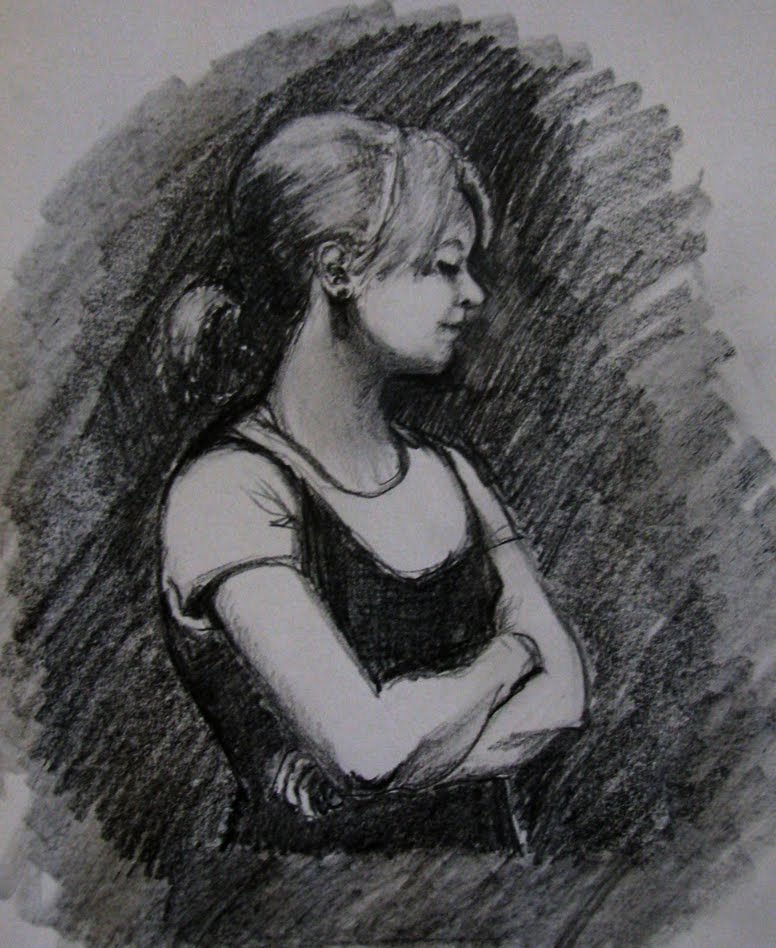
I didn't paint this weekend but I did draw. I'd like to paint my niece Olivia because she is just all around fantastic, so I have been drawing her a bit. The two drawings here are so-so, but I am trying to work out the issues before I start painting. It is incredibly hard to capture exactly what it is that makes a person's face THEIRS - it comes down to just one little line, angle, shadow...


This  drawing of Olivia looking up is problematic. Her eyes are too close - her nose is just not right at all - not even remotely like her nose, and the face is kind of long. I suppose it doesn't really matter if it doesn't look like her for the painting's sake, but if I was doing a real "portrait" of someone, it should actually look like the person.


I sketched it onto a canvas because I want to try painting a face and see what happens. But I really should do some more sketches first - although I think the eyes and nose are better on the canvas drawing.

Wednesday, June 2, 2010

Waiting

This is the second painting that I did at the workshop ( actually it is the 3rd, I wiped the second - day two didn't work out so well for me :) ). This painting went through some stages before it got here. I can't say that it follows Karin's style but I incorporated the amazing things that I learned from her into this painting - simplification, shapes, light and color. Halfway through I decided to experiment and  lay paint down without blending. That meant that every brush stroke resulted in a color that stayed there - no covering it with another stroke. So whatever I put down stuck.

I wish I had taken a photo when it was at that stage because it was kind of cool. I finally "got" the concept that laying down colors next to each other creates an optical illusion - your mind blends them. That is what the impressionists did. Simply stated it means that a yellow stroke next to a blue stroke causes your mind to see green. I didn't do anything that drastic, but I discovered that monochromatic variations next to each other create a very cool effect. The painting started to shimmer and move.

I didn't keep it that way because even though it was cool, and I really learned something big, it didn't work for this painting. Amy Stewart (a very talented artist at the workshop - check out this incredible painting she did on day two - same day I was in misery) said something about liking the distinct shapes of color and light of the man, and that it would be interesting if the shadows were more distinct shapes. As soon as she said it I understood exactly what she was saying and I simplified some more.

So here is my painting. Its called "Waiting". I don't think everyone will like this, but I really really do.
Waiting
Oil on 8x8 Panel

 
a

Monday, May 31, 2010

New York...these streets will make you feel brand new...

Alicia Keys -  "Empire State of Mind" is a such a fabulous song. I could listen to it over and over again (and I do). I believe I have a girl-crush on Ms. Keys.

Just came back from 7 days in NYC. Fantastic in every way - even the annoying things were great. I love that city - the energy, the noise, the smells (sometimes really really bad), the lights, the traffic, the art, the endless supply of good food and fantastic restaurants, and above all, the people. I have been to the city maybe a dozen times total, and every time I go I am surprised by how different it is from Boston. People actually talk to you in NY and I am amazed at the humanity and kindness. That is counter to the stereotype of NY but I find Boston to be very cold and aloof, while NY is warm and engaged. Just don't piss them off.

I was there to take a painting workshop with Karin Jurick. I learned so much and I am re-energized. Karin is incredible, the art-changing thing that I took from the class is that I need to trust my instincts. Karin paints what she loves and in a way that makes sense to her. She is so completely honest in her approach to life and it permeates everything she does, including her painting. I found it unbelievably freeing. I have read so many books on painting and agonize over the "rules" to the point where they paralyze me. I used to be a bit of a rebel but I eventually succumbed to what I thought I was supposed to do. Conforming works ok for my day job but does not work for art and I need to get the freedom back if I want to be the kind of artist I hope to be.

I only painted two paintings at the workshop. Here is the first painting - I will post the second in a couple of days. We all painted the same subject - I like this a lot, and I was able to just place the paint down without agonizing. Of course it helped that I got to watch her paint first.  The second painting is completely different from anything I've ever painted - it feels like a bit of turning point. You'll have to wait and see - I guess you'll either love it or hate it.

Sunday, May 2, 2010

Summer Shack

I am almost finished with the painting that I started two weekends ago. I worked on it last weekend a bit, and this weekend I only had one day to paint and I painted non-stop for 8 hours (after I did my required 1.5 hour procrastination). That is what is so great about painting - I get totally lost in what I'm doing and time goes by unnoticed. Impossible for me to think about anything but what I'm working on.

My So Called House
Oil on 9x12 Canvas


There are a few things I still want to do - break up the cast shadow in the foreground so it doesn't look like a big triangle, darken the front shadow on the house, straighten the basement door and do a couple of things on the trees in the upper left. I also think I'm going to connect the light sections of the leafy tree on the right. I may put the rungs in the porch railing - I needed it to dry a little so it didn't get all muddy.

Working from one side of the painting to the other worked well for me because I was able to keep control of the color and not get all confused like I usually do. I'm pretty excited about this painting because I finally "got" some stuff that I've been trying to do for so long - simplifying the color shapes, minimal blending, and capturing light.  I also left out stuff that I didn't think worked in the composition. That was one of the things my painting teacher kept telling me last year - just because its there, doesn't mean you have to paint it.

The giant palette was really fun - (in the previous post I talked about Karin Jurick's recommendations). My favorites were radiant lemon, radiant white, indigo blue, portland grey medium, violet grey, horizon blue - the coolest colors that really made a difference for me. Also used cobalt blue for the first time which is an awesome color and one that I see on lots of other artist's palettes.

Sunday, April 18, 2010

A new approach - Karin Jurick style

I'm taking a workshop in May and I received the supply list a couple of weeks ago. The artist teaching the class, Karen Jurick, has a list of paints that must be at least 30 tubes. I was missing many of the colors she requires so I ordered a whole bunch of new paint that came on Friday - 24 tubes.

This weekend I decided to try to use some of the new, very cool colors. Colors like "radiant lemon" and "violet grey". I was nervous because normally I keep my palette very small so I don't get confused. For example last week's raft painting used only 5 colors and I mixed what I needed from those. I found a video where she lays out her palette and it is amazing how many colors she uses.

This is an example from her Painting a Day blog :


Everything she does breaks all the rules from all the books I've read, and from what I was taught in last year's painting class. Not only does almost every book say use a limited palette - red, blue, yellow, white - with 2 of each (warm and cool) and a couple of earth tones - I've also been taught that you should  work the entire painting evenly. The rule is to move all over the canvas and not focus in one area.

Karin breaks those rules. I found a demo of her painting technique .She sketched out her scene and then began filling it in. Her sense of color and light is incredible and she seems to just understand the value she needs automatically. If you're interested take a look at her from the link above- I love her brush work and color.

This weekend I used a big palette and tried her method of painting from one side of the canvas to the other. I didn't sketch out the whole composition first, I just focused on making sure that the cottage was accurately drawn because of the perspective challenge. I also didn't paint on a dark ground as she does - I'll try that on the next one.

So far so good. I thought all the colors and the method of painting from one side to the other would screw me up, but it is working out pretty well. This is a painting of my house and is about 9x12. I'm only half-way done but I like where its going. The only negative is that I wanted to keep painting and I have to go to work tomorrow! The photo makes the colors a little too yellow and the contrast is too severe,  but otherwise it is pretty accurate. I will finish covering the canvas and then I will go back to deal with the light and shadow.